Our story · 2 min
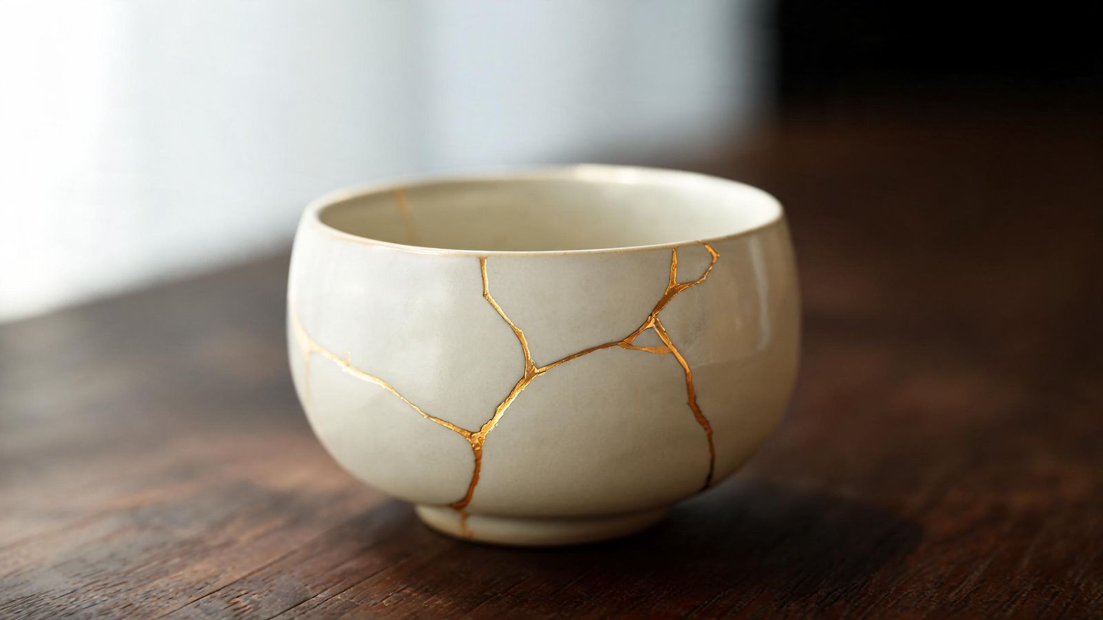
The Goldmend Design logo is a bowl with a gold line running through it. It comes from kintsugi, a Japanese way of repairing broken pottery with lacquer and gold. The crack isn't hidden. It becomes part of the bowl's story, and often the most beautiful part.
We chose it because it describes how we want our tools to treat your work.
Start from what you already have
Most people who come to a website builder or a photo editor are not starting from nothing. You already have a business name, a shop sign, a stack of phone photos, a menu printed at the corner shop, a logo a cousin made ten years ago. Those things carry meaning for your customers.
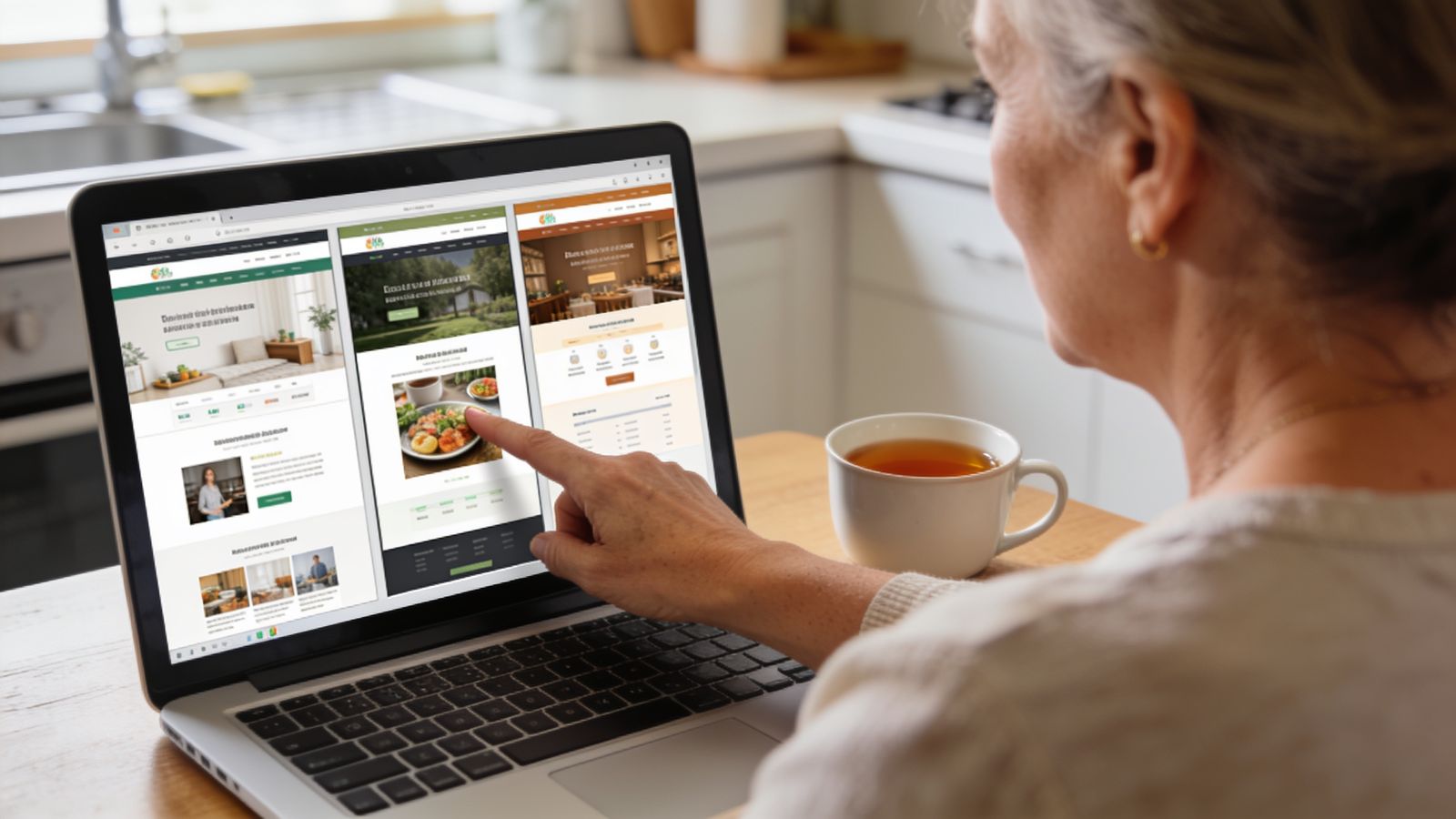
Our products try to begin there. Builder asks what your business is and what you already use. Goldmend Photos edits the photos you took instead of replacing them with stock pictures. The tools we are building for apps and graphics will follow the same rule.
Repair, don't replace
A rebrand that throws everything away can confuse the people who already know you. Often the better move is smaller:
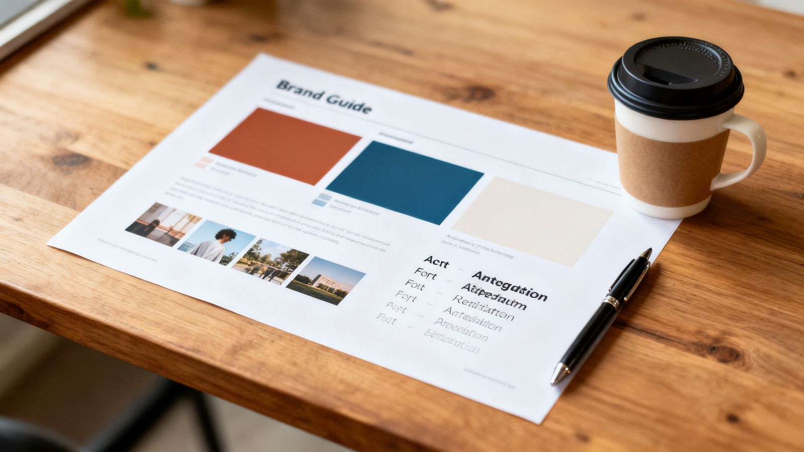
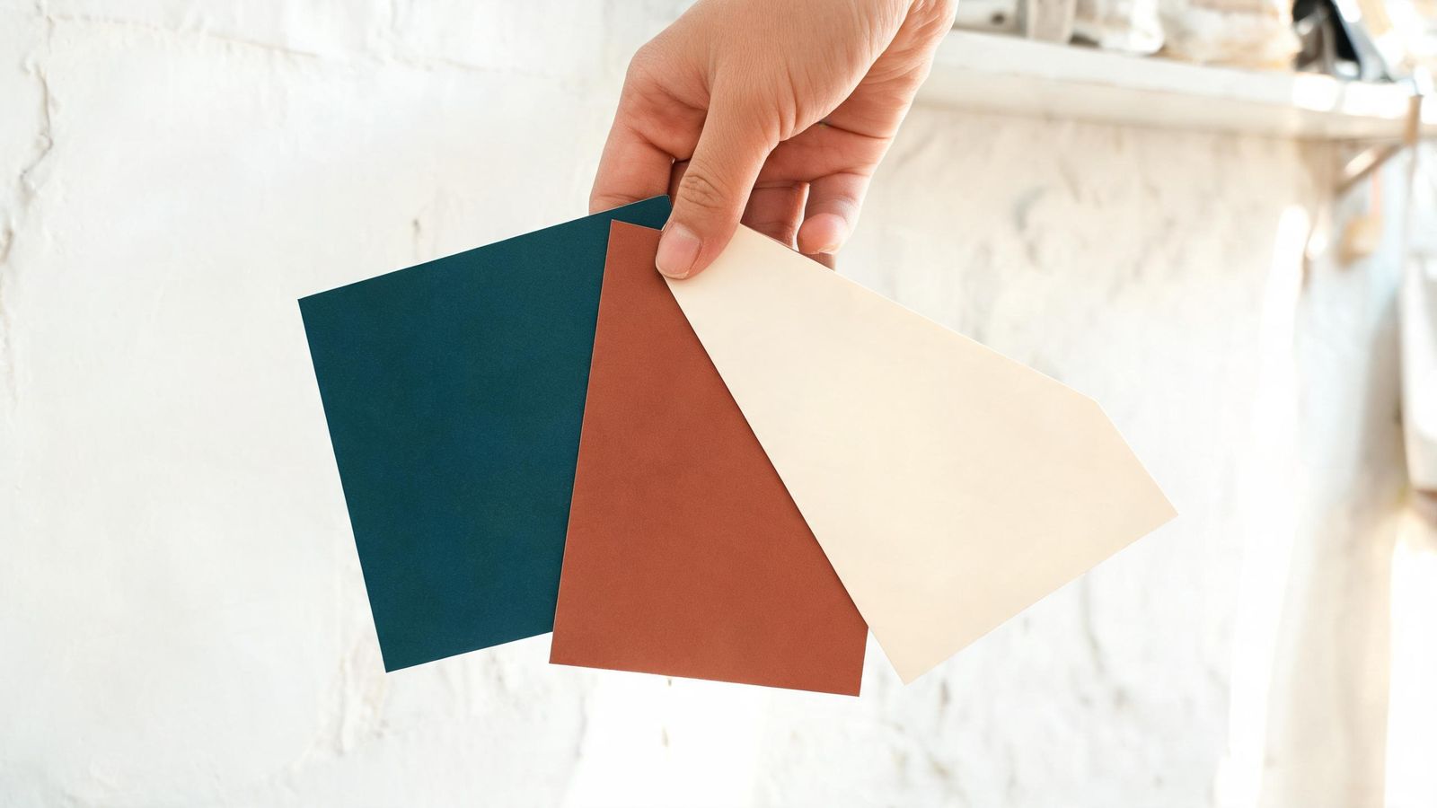
- keep your name and the colours customers recognise
- fix what is hard to read or hard to use
- add what is missing, like a clear way to contact you
That is the gold seam: a careful fix that makes the whole thing stronger.
You stay in charge
AI can produce a lot, fast. That's useful, but it can also bury you in choices or quietly change things you cared about. So every Goldmend Design product shows you a small number of finished options, lets you change them by describing what you want, and never publishes or spends money without asking you first.
One studio, four products
Goldmend Design is a family from Goldmend Studio, a small company in Singapore. Builder makes websites. Goldmend Photos edits photos. Two more, for phone apps and for graphics, are on the way. Each has its own name, and each one carries the mended bowl.