Planning · 2 min
The best way to start an app isn't a list of fifty features. It's one page that answers four questions.
1. Who is it for?
Be specific. "Regular customers who come at least once a week, mostly office workers who order on the way to work." Not "everyone".
2. What are the three main things they'll do?
Only three. For example:
- order their usual coffee ahead
- collect a stamp with each order
- see this week's specials
Everything else can wait for version two.
3. What does each main screen show?
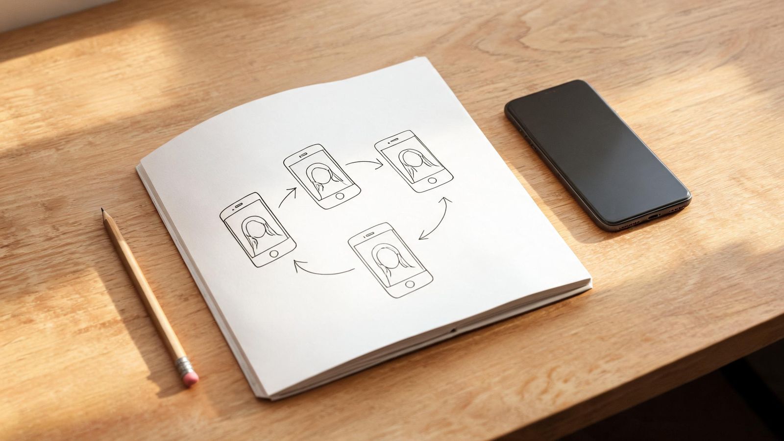
Sketch each screen as a box on paper. What's at the top? What's the big button? Where does it lead? Five to eight screens is plenty for a first version.
4. How will you know it's working?
Pick one or two signs:
- "Half of our regulars use it within three months"
- "Morning queue is shorter"
- "Fewer missed bookings"
Also note
- Your brand: name, colours, logo, photo style (copy from your brand sheet).
- Languages your customers need.
- Who keeps it updated, and how often.
Why this works
A short plan forces you to choose. Choosing is what makes an app simple, and simple apps are the ones people keep using.