Social · 2 min
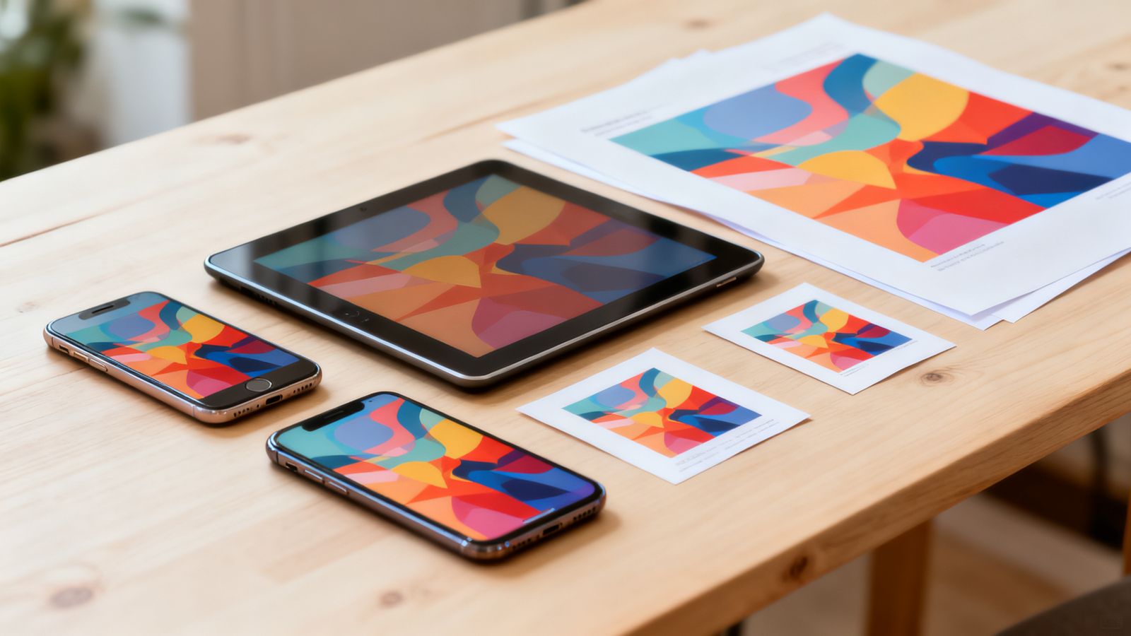
The same message often needs to go to several places, each with its own shape. Designing for the right shape first saves cropping disasters later.
Social media
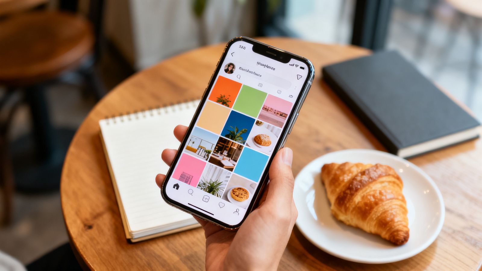
- Square, 1:1: feeds on most platforms. Safe default.
- Portrait, 4:5: takes more screen space in feeds.
- Story or reel, 9:16: full-screen and tall. Keep text away from the top and bottom, where buttons cover it.
- Landscape, 16:9: video thumbnails and some link previews.
Web
- Website banners: wide, but they get cropped on phones. Keep the important part in the middle.
- Link previews: roughly 1200 by 630 pixels.
- A4: posters for notice boards, price lists.
- A5: flyers, menus.
- A3 and larger: posters for walls and windows.
- Business cards: sizes vary by country, so ask your printer.
Some countries use US Letter instead of A4. If you print abroad, check.
Design once, adapt carefully
Start with the most important format. Then adapt for the others:
- move the text, don't just shrink it
- recrop the photo so the subject stays centred
- check the logo is still visible
Leave a safe margin
Apps crop and printers trim. Keep text and logos away from the edges in every format.