Brand · 2 min
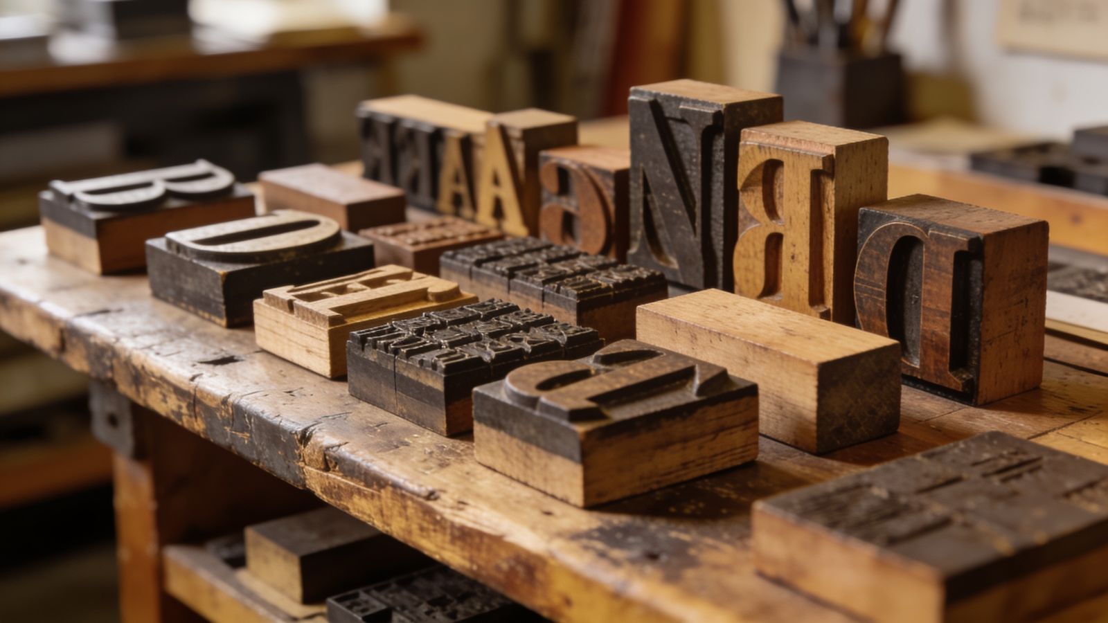
Fonts carry personality. A rounded font feels friendly, a thin elegant one feels upmarket, a heavy square one feels strong. But the main job of a font is simpler: people need to read it, quickly, on a small screen.
Two fonts are plenty
- Heading font: this one can have character. It's used large and short.
- Body font: this one should disappear. It's for prices, opening hours, descriptions. Choose something plain and clear.
Many good brands use a single font family in different weights. That's fine too.
What makes a font easy to read
- Letters that are clearly different: capital I, small l and number 1 shouldn't look the same.
- Open shapes, so small letters like e and a don't close up when tiny.
- Enough weight. Very thin fonts disappear on phones and in sunlight.
Think about every language you need
If your customers write in Arabic, Thai, Chinese, Hindi, Vietnamese or any language with accents, check your font supports them before you commit. A font that only covers English will swap in a random fallback for missing letters, and your page will look broken.
Large free font libraries list which languages each font supports. Families like Noto were made to cover almost every script.
Free and safe to use
Use fonts with a clear licence that allows business use, on the web and in print. Free libraries like Google Fonts are a safe start. Avoid downloading fonts from random sites; you may not have the rights.
Size matters more than the font
Most readability problems aren't the font, they're the size. On phones, body text should be at least 16 pixels. Headings should be clearly bigger, so people can scan.