Brand · 2 min
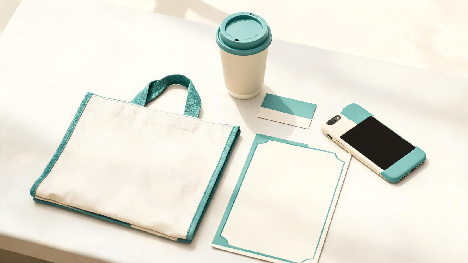
A customer might see your poster on Monday, your website on Wednesday and your social post on Friday. If they all look like different businesses, the poster doesn't help the website and the website doesn't help the post. When they match, each one reminds people of the others.
What "consistent" means in practice
Not everything has to look identical. Keep these the same:
- Name and logo: always the same spelling and the same version.
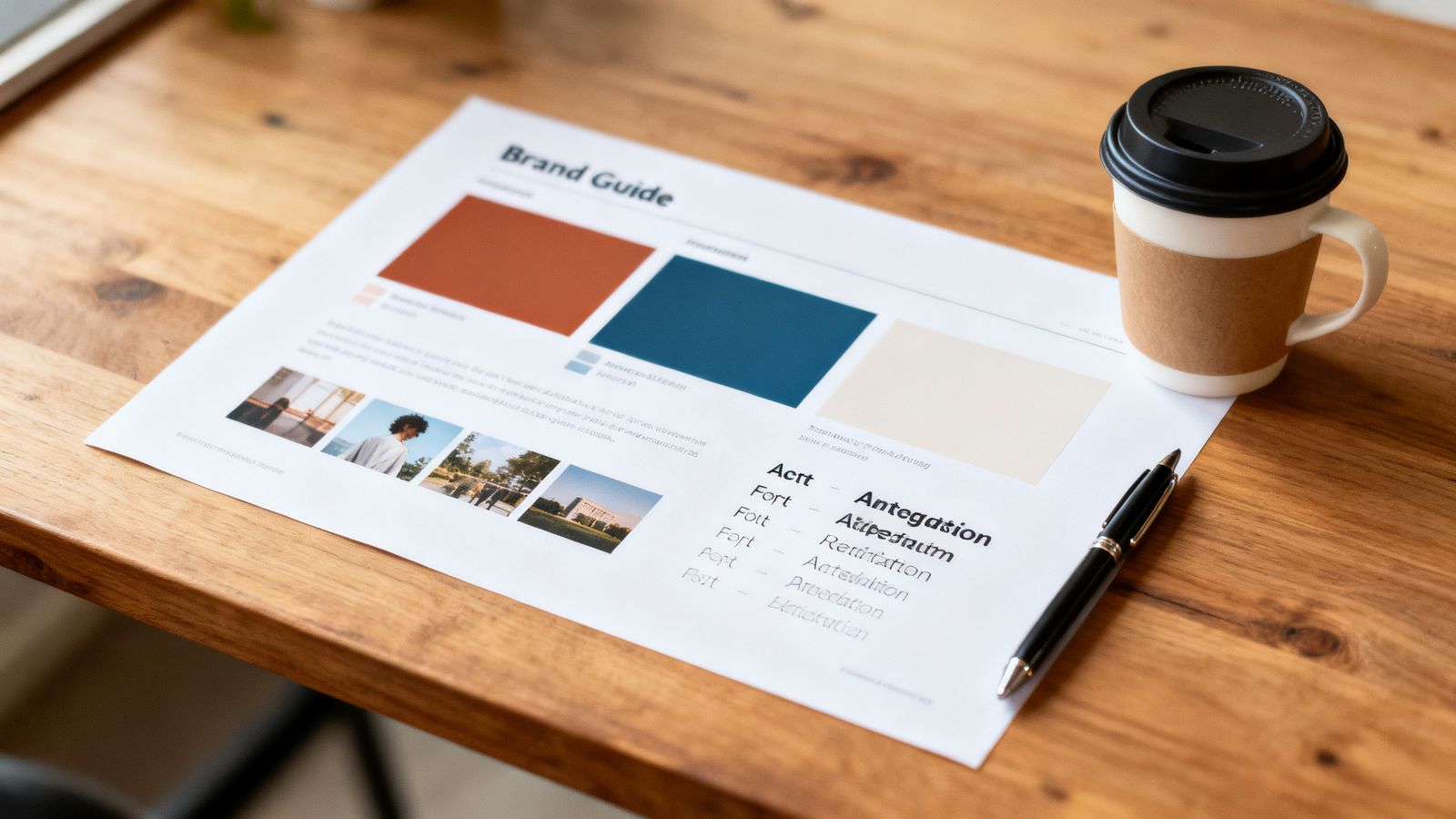
- Colours: the same two or three, with the same codes.
- Fonts: the same heading and text fonts, or close cousins.
- Photo style: similar light and backgrounds.
- Voice: the same tone, whether it's a sign or a caption.
You can still vary layouts, pictures and messages.
A simple routine
- Keep a brand sheet (one page) with the five things above.
- Make a few templates: a poster, a social post, a price list. Change the words and photos, keep the layout.
- Before publishing anything, put it next to your website. Does it look like the same business?
The places people forget
- your profile picture on messaging apps
- receipts and invoices
- the email signature
- map listings and review sites
- the sign on the door
These small touches are often where customers first meet you.
Where Goldmend Design is heading
We're building our four products so they can share one set of brand settings: set your colours, fonts and logo once and use them for your website, photos, app and graphics. Until that's ready, your brand sheet does the same job.