Brand · 2 min
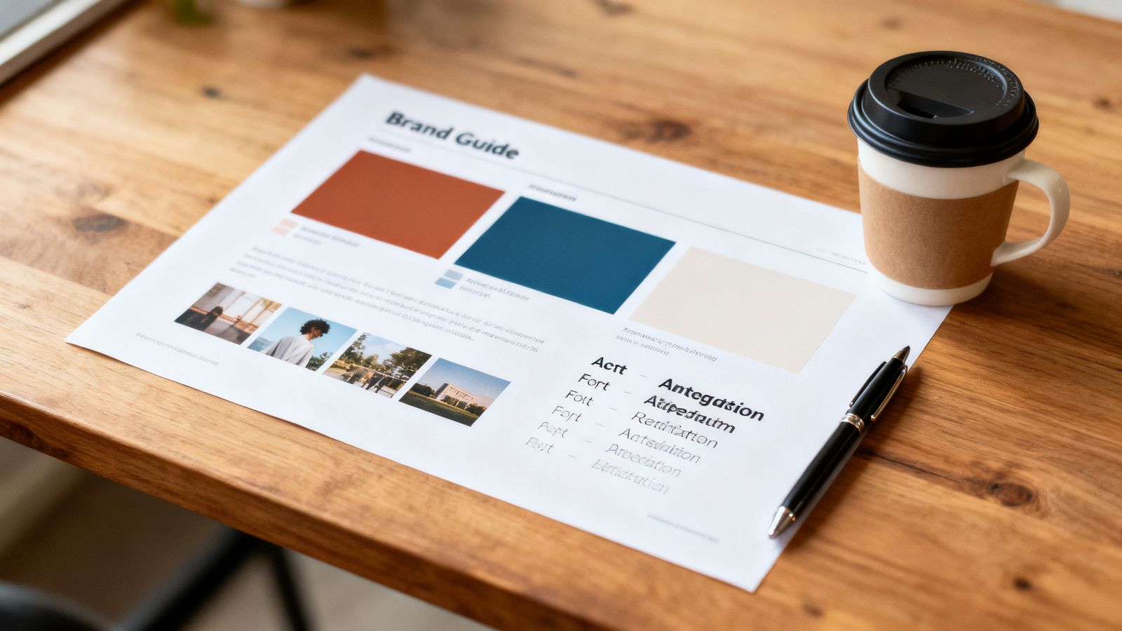
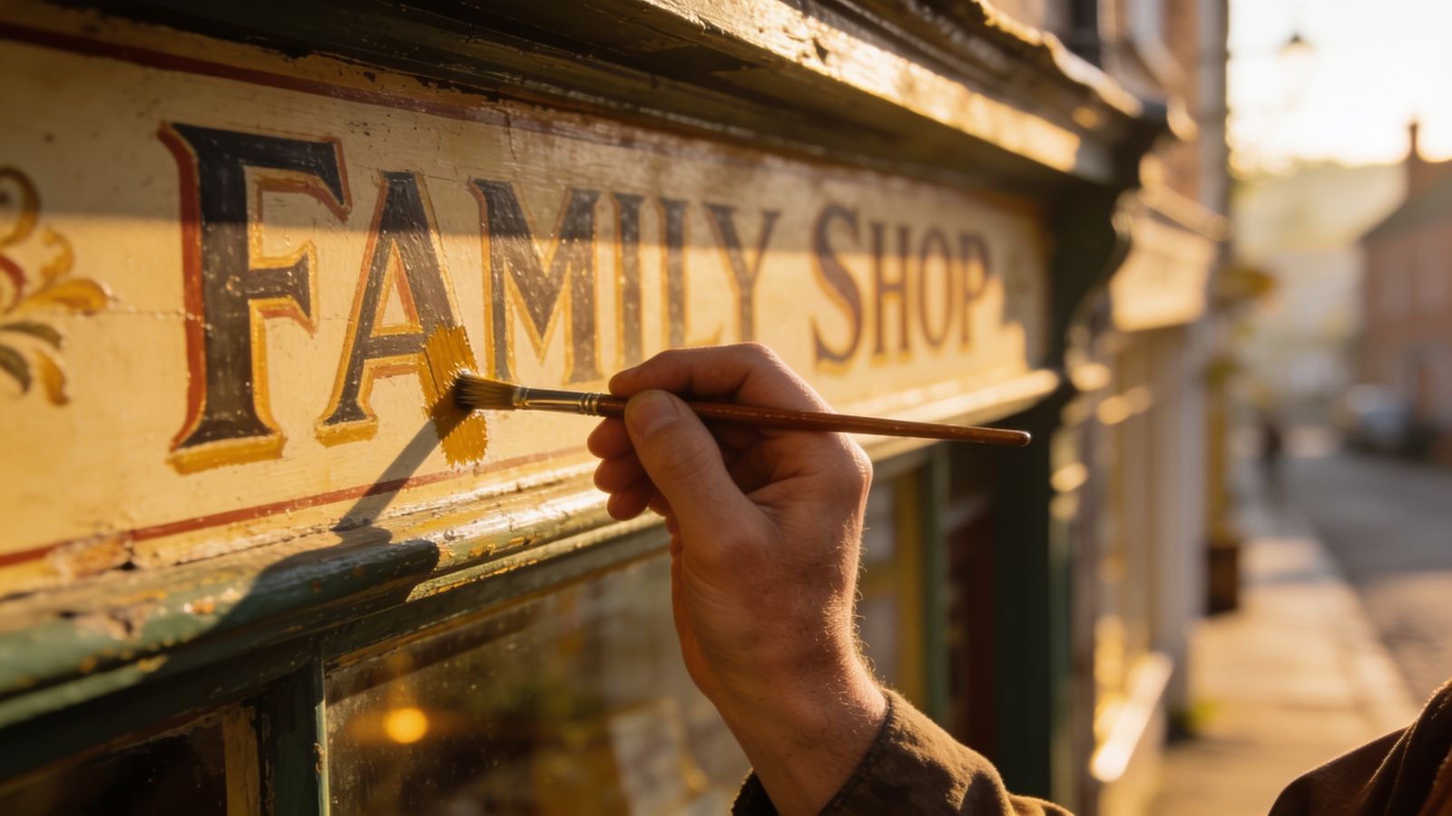
When a website or logo starts to look tired, the temptation is to throw it all away and start again. Often the better answer, and the more Goldmend answer, is a careful repair.
First, find out what's actually wrong
Ask customers and look honestly:
- Is it hard to read? Small text, low contrast, too much on one screen.
- Is it out of date? Old photos, old prices, old opening hours.
- Is it hard to use on phones? Tiny buttons, sideways scrolling.
- Or do you just feel bored of it? (Customers may not be.)
Keep what customers recognise
Your name, your main colour and the general shape of your logo are worth a lot. People recognise them from across the street. Keep them unless there's a real problem.
Fix in this order
- Facts: correct every price, hour and address.
- Photos: replace the oldest and darkest ones.
- Readability: bigger text, better contrast, shorter paragraphs.
- Phones: make sure everything works with one thumb.
- Style: only now, refresh fonts, spacing and details.
Modernise a logo gently
- Simplify: remove thin lines and small details that disappear at small sizes.
- Tidy the lettering: one font, consistent spacing.
- Make a small version for app icons and profile pictures.
- Keep the colour, or move it only slightly.
When to really start over
Sometimes a fresh start is right: a new name, a new kind of business, or a design so broken that fixing costs more. That's fine. Just make sure customers can still find you, and tell them what changed.