Design · 2 min
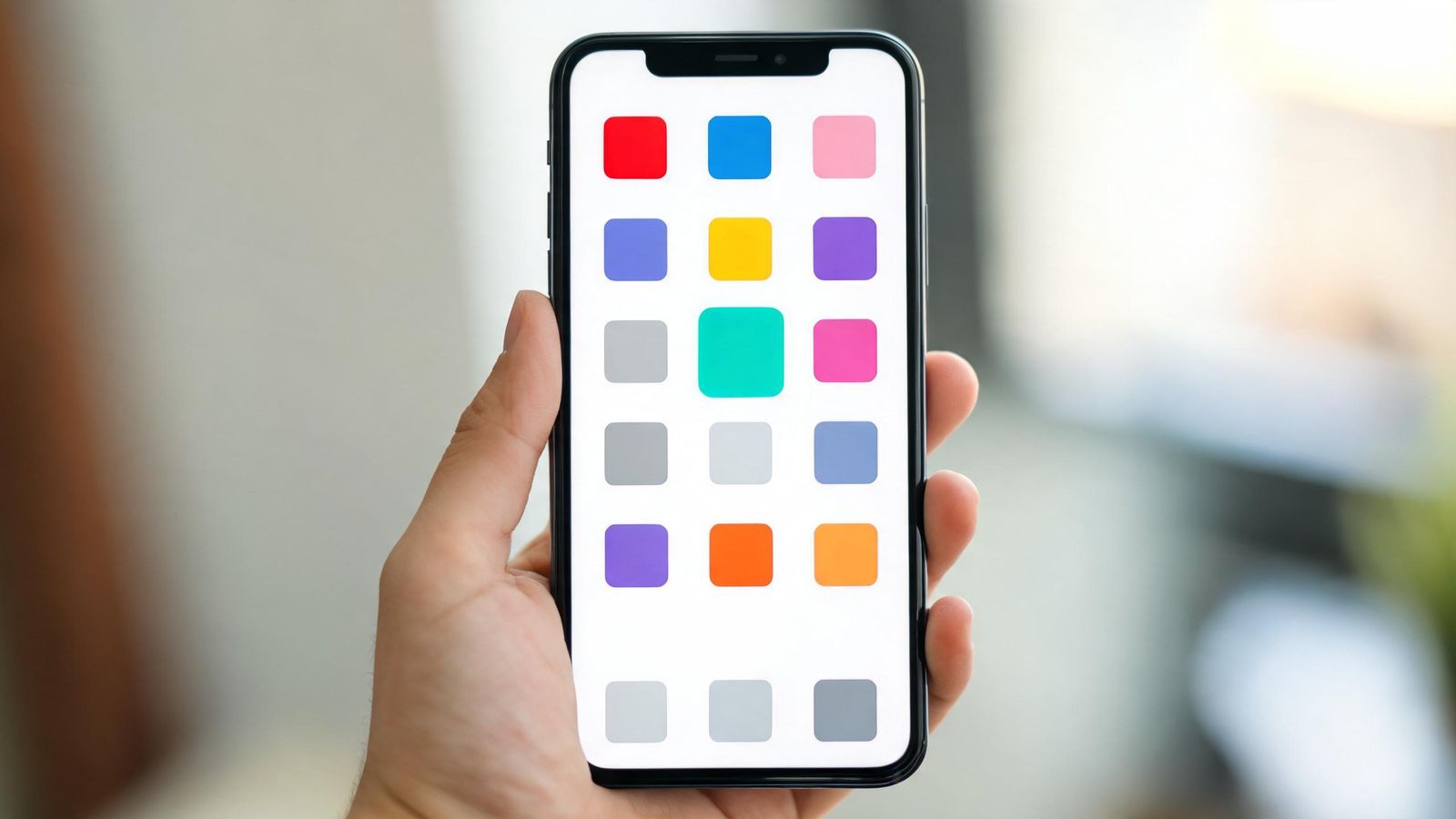
Your app icon will be shown at about the size of a fingernail, next to dozens of other icons. It needs to be recognised in a glance.
Simple shapes
One bold shape works best: a letter, a symbol from your logo, or a simple object. Thin lines, small text and fine details disappear at icon size.
Use your brand colour
A strong background in your main brand colour helps people find your icon instantly, and links it to your shop, website and posters.
Usually, no words
Words become unreadable at icon size, and the app's name already appears under the icon. One letter is fine. A full name usually isn't.
Test it small
Shrink your design to about 1 cm on a screen and put it among real icons. Can you find it in two seconds? Can someone else?
Test it in dark mode
Many people use dark mode. Check your icon looks good on both light and dark backgrounds.
Avoid look-alikes
Don't copy the style of a famous app. App stores can reject icons that look like other brands, and customers may be confused.
Sizes
App stores need the icon in several sizes. Start from a large, square version (at least 1024 by 1024 pixels) with no transparency, and let your tools make the smaller ones.