Design · 2 min
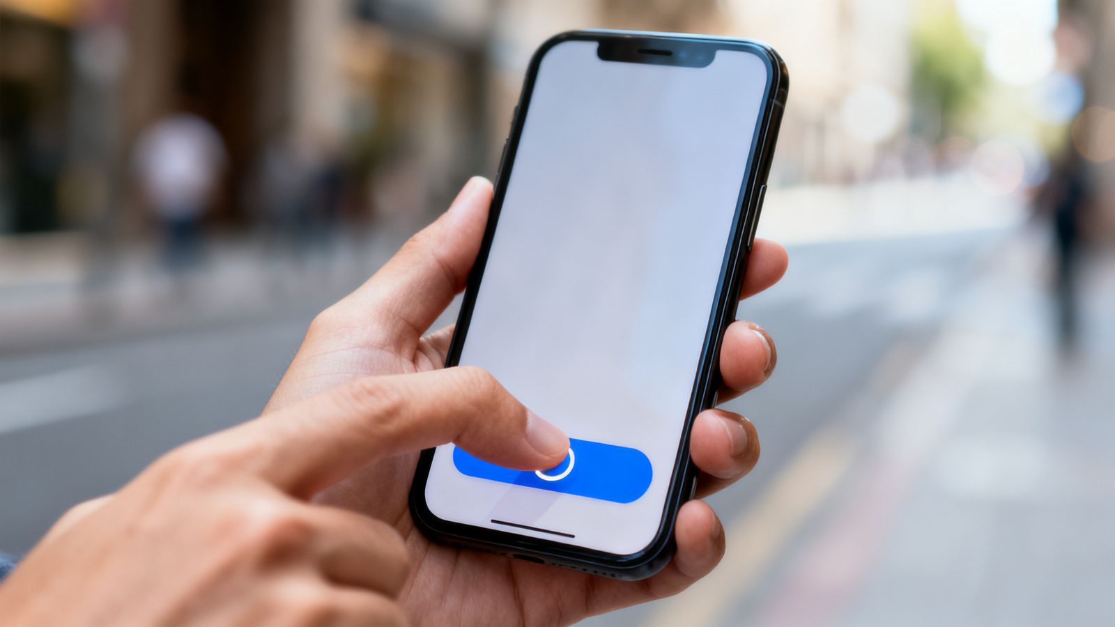
Most people hold their phone in one hand and tap with their thumb. That simple fact shapes good app design.
The easy zone
The bottom half of the screen, and especially the bottom centre, is easiest to reach. The top corners are hardest, particularly on big phones.
- Put the main action near the bottom.
- Put navigation in a bar at the bottom.
- Keep the top for titles and things used less often.
Big enough to hit
Make buttons at least 44 by 44 points (roughly the size of a fingertip), with space between them. Small buttons close together cause wrong taps, and wrong taps make people give up.
One main action per screen
Each screen should have one obvious thing to do: "Book", "Order", "Next". Make it the biggest, boldest button. Other options can be quieter.
Bottom navigation
Three to five tabs, each with an icon and a word. Icons alone are often misunderstood.
Mind the edges
Modern phones have rounded corners, notches and gesture bars. Keep buttons away from the very edges so they don't clash with the phone's own controls.
Forms
- one question per line
- the right keyboard: numbers for phone numbers, email keyboard for emails
- big "Next" buttons
- remember answers, so people don't type them twice