App ideas · 2 min
Ordering ahead lets busy customers skip the queue and lets you prepare in calmer batches. The design challenge is keeping it quick for customers and manageable for the kitchen.
The menu
- Photos of real items in the same style. Goldmend Photos can help.
- Clear names and prices, with the currency.
- Allergy and dietary labels that are accurate and checked.
- Sold-out items marked clearly, not hidden.
Customising
Keep options short: size, milk, sugar, extra shot. Too many choices slow everyone down, including the kitchen.
"My usual"
Most morning customers order the same thing. Put "Order my usual" on the first screen.
Pick-up times
- Let customers choose a time slot, like 8:15 to 8:30.
- Limit orders per slot so the kitchen isn't swamped.
- Show a realistic ready time, and send a message when it's ready.
Paying
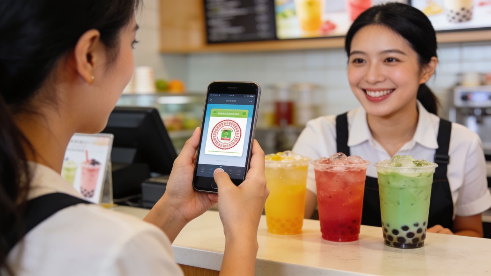
Let a payment provider handle card details. Offer the payment methods common where you are, like local e-wallets, and say whether people can pay at the counter instead.
The kitchen view
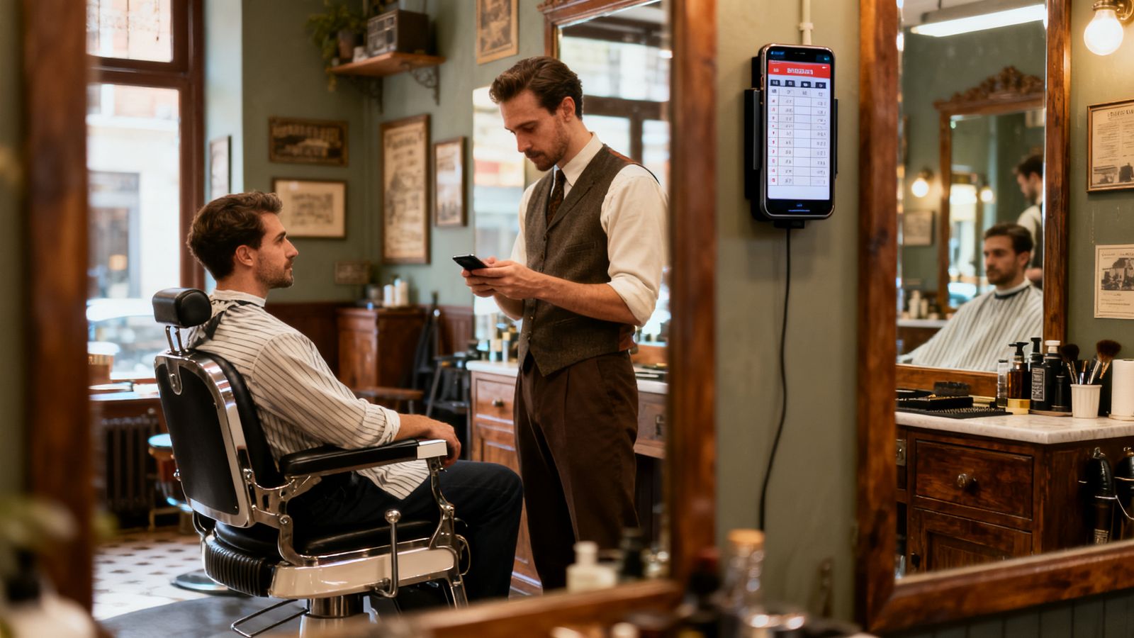
Your side needs one big screen or printed ticket per order, in time order, with a "ready" button. If the kitchen can't keep up, you need a quick way to pause new orders.
A pick-up shelf
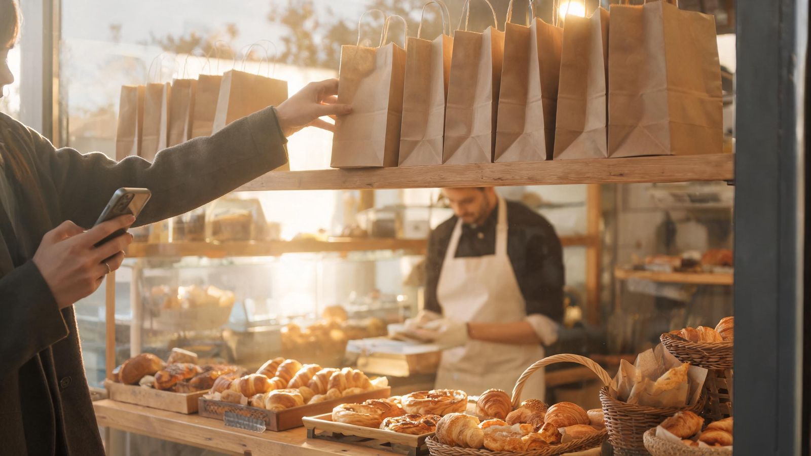
The simplest real-world fix: a shelf near the door with names on the bags. No one waits at the counter.