Basics · 2 min
When someone looks at your design, their eyes go somewhere first. You decide where. That's called visual hierarchy.
The tools
- Size: bigger things are seen first.
- Weight: bold stands out from regular.
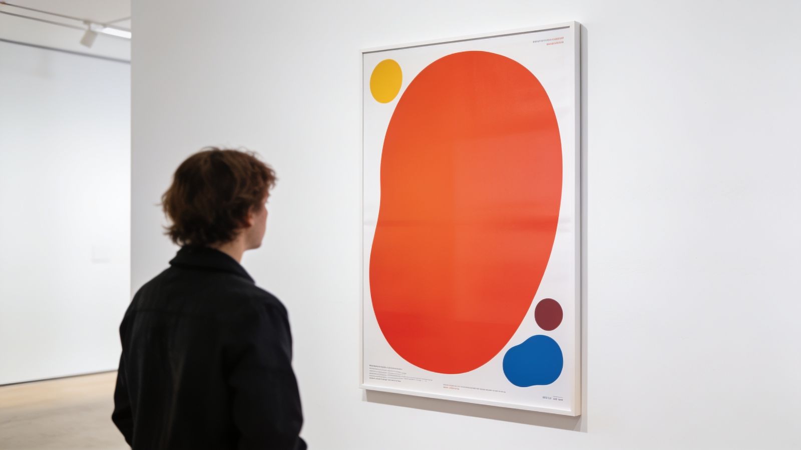
- Colour: a bright accent pulls the eye on a calm background.
- Position: people usually start at the top and, in many languages, the left.
- Space: something with empty space around it stands out.
Decide the order first
Before designing, number your information:
- the main message
- the key detail (date, price, offer)
- how to act (where, how to contact)
- everything else
Then make number 1 clearly the biggest, number 2 smaller, and so on.
Don't make everything important
If everything is bold, big and coloured, nothing stands out. Use emphasis for one or two things only.
Group related things
Put the date, time and place together. Put contact details together. Groups are easier to scan than scattered bits.
Test it
- Squint test: half-close your eyes. What do you still see? It should be your number 1.
- Five-second test: show it to someone for five seconds, then ask what it was about.