Basics · 2 min
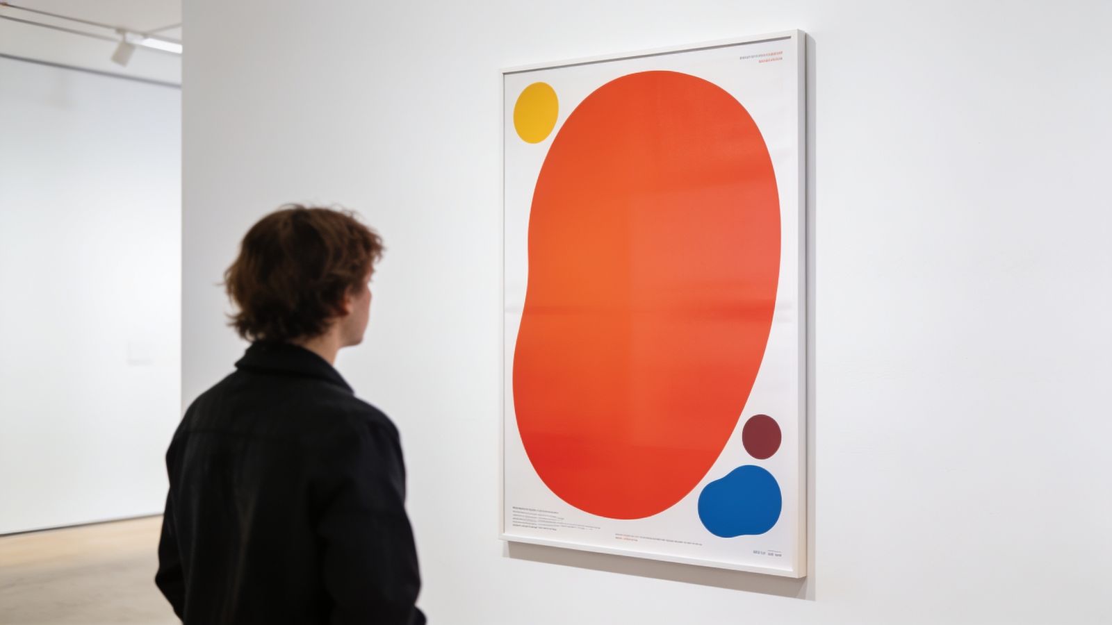
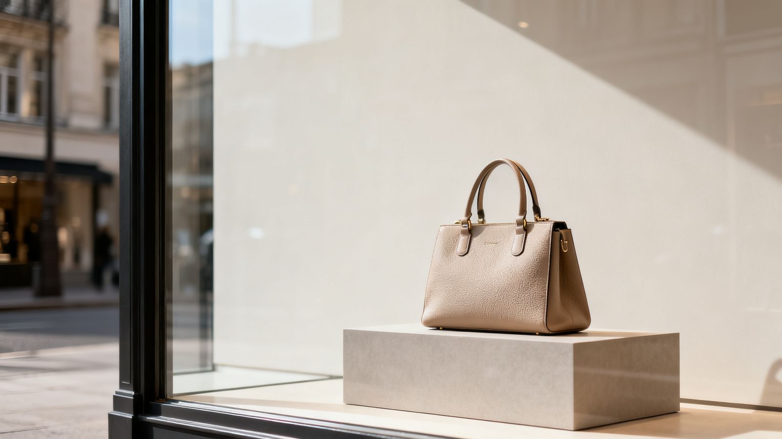
Look at a luxury shop window: one item, lots of space. Look at a discount flyer: every centimetre filled. Space sends a message.
Space helps people read
Text squeezed together is tiring. Space between lines, paragraphs and sections lets people find their place and scan.
Space shows what's important
Something surrounded by space looks important. That's why a headline with room around it stands out more than a bigger headline in a crowd.
Space feels confident
Filling every gap can look nervous, like you're trying too hard. Space says: we don't need to shout.
Where to add space
- around the edges (margins)
- between the headline and the rest
- between groups of information
- between lines of text (around 1.4 to 1.6 times the text size)
Making room
If your design feels crowded, don't shrink everything. Remove something:
- Do you need both the slogan and the description?
- Do you need all six photos?
- Can the details go on the website instead?
Not empty, calm
"White space" doesn't have to be white. It's any area without content: a plain colour, a quiet background.