Design · 2 min
Phones have powerful accessibility features built in: larger text, screen readers, voice control, colour filters. A well-made app works with them. A careless one breaks.
Respect the text size setting
Many people increase their phone's text size. Your app should grow its text with it, and the layout shouldn't break. Test at the largest setting.
Strong contrast
Dark text on light backgrounds, or the reverse. Avoid pale grey text. Remember people use phones outdoors in bright sun.
Labels for everything
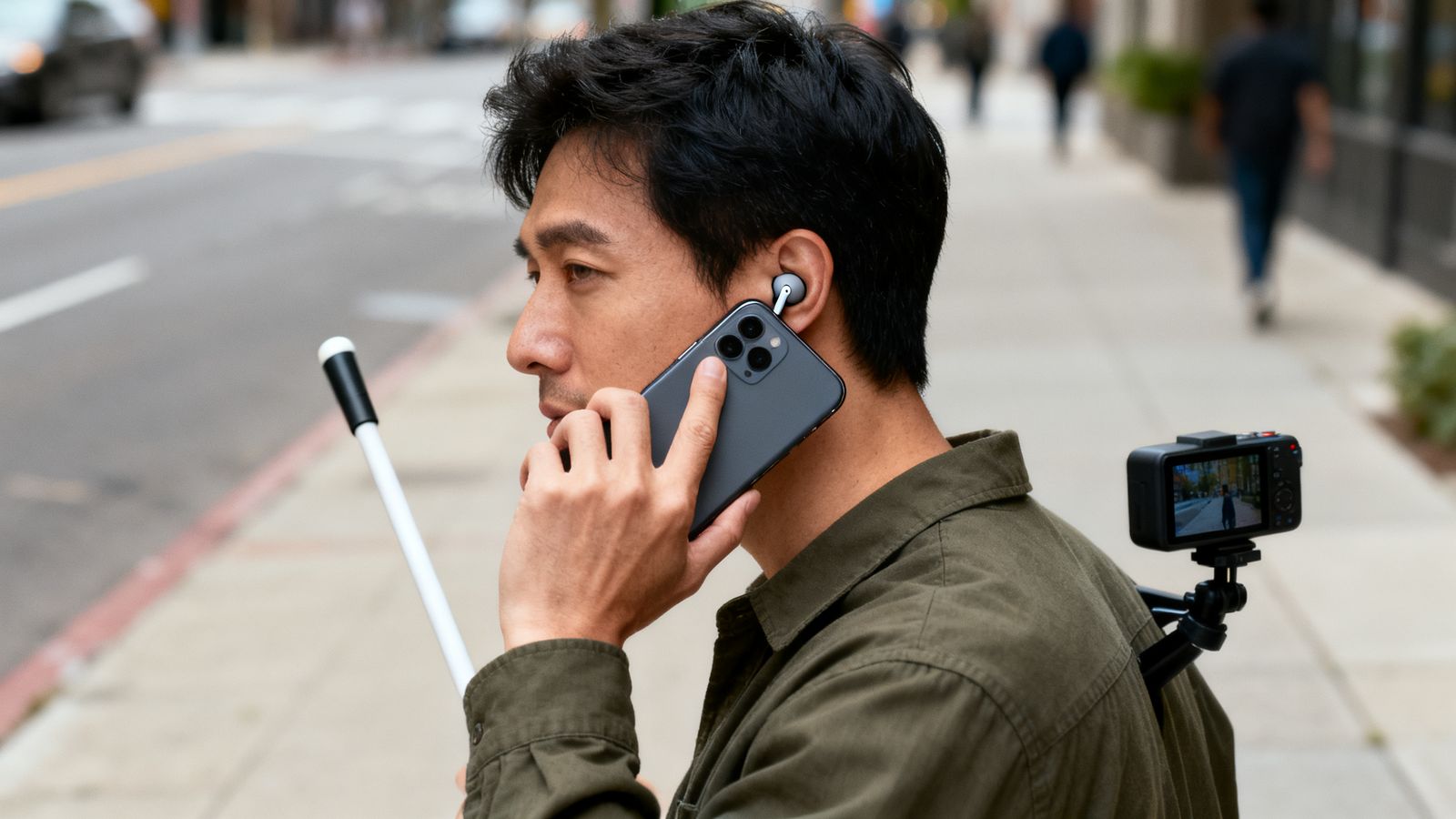
Screen readers read out the label of each button and image. An icon-only button with no label is read as "button", which is useless. Give every button a clear name: "Add to order", "Next week".
Don't rely on colour or gestures alone
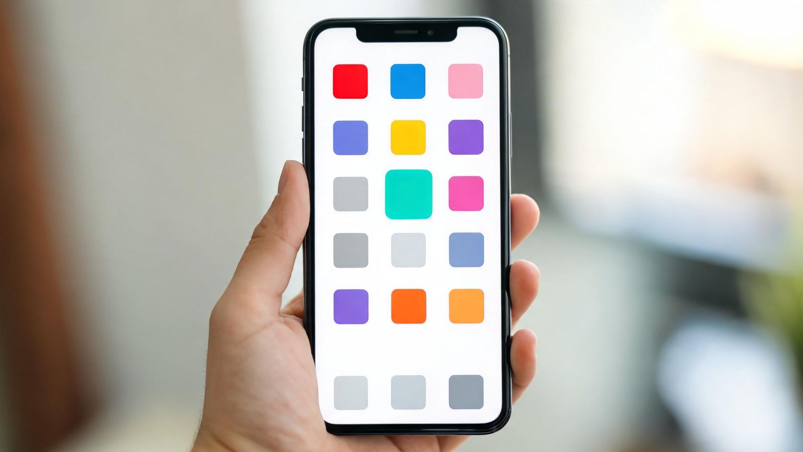
- "Tap the green slots" fails for colour-blind users. Add words.
- Hidden swipe gestures should always have a visible button alternative.
Big targets, clear focus
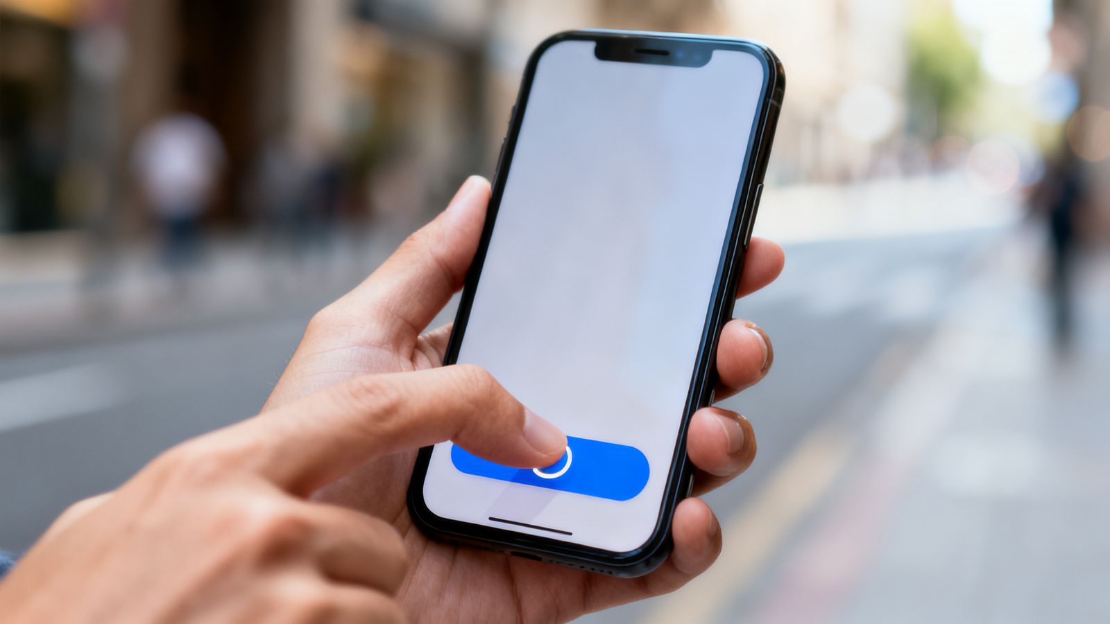
At least 44 by 44 points for anything tappable. If someone uses a keyboard or switch control, the focused item should be clearly visible.
Plain language
Short sentences and common words help everyone, including people reading in their second language and people with cognitive disabilities.
Motion
Respect the "reduce motion" setting. Avoid flashing content.
Test it
- Turn on your phone's screen reader (VoiceOver or TalkBack) and try to complete one task.
- Set text to the largest size and use the app.
- Try it in sunlight.