Design · 2 min
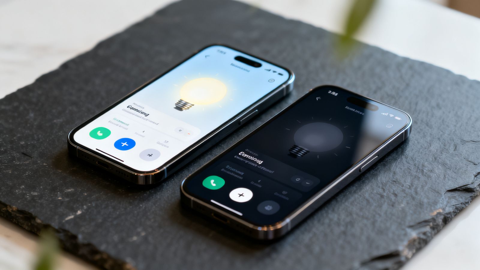
Many people set their phones to dark mode, especially in the evening. An app that ignores this can glare like a torch at night. One that handles it well feels thoughtful.
Don't just invert colours
Dark mode isn't "swap black and white". Pure white text on pure black is tiring to read. Use a very dark grey or navy background and slightly off-white text.
Adjust your brand colour
Your main colour may look too bright, or too dull, on a dark background. Make a slightly lighter or softer version for dark mode, and check text on it is still readable.
Mind your logo and icons
A dark logo disappears on a dark background. Prepare a light version of your logo, like the light and dark versions of the Goldmend Design logo, and use the right one automatically.
Photos
Photos usually look great in dark mode. Avoid photos with white boxes around them; they glow.
Let people choose
Follow the phone's setting by default, and offer a choice in settings: light, dark or automatic.
Check contrast twice
Contrast that passes in light mode can fail in dark mode, and the other way round. Check both, especially grey text and coloured buttons.
Test at night
Open your app in a dark room in dark mode. Anything that feels too bright, or anything you can't read, needs fixing.