Logos · 2 min
This is a made-up example. "Golden Crumb Bakery" is not a real business.
Rosa's bakery has been open for twelve years. Over time, her graphics grew messy: the sign uses one font, the menu another, flyers were made by different people, and the social posts use whatever template looked nice that day.
What she kept
- The name and the wheat-ear symbol customers know from the sign.
- The warm terracotta colour of the shopfront.
What she tidied
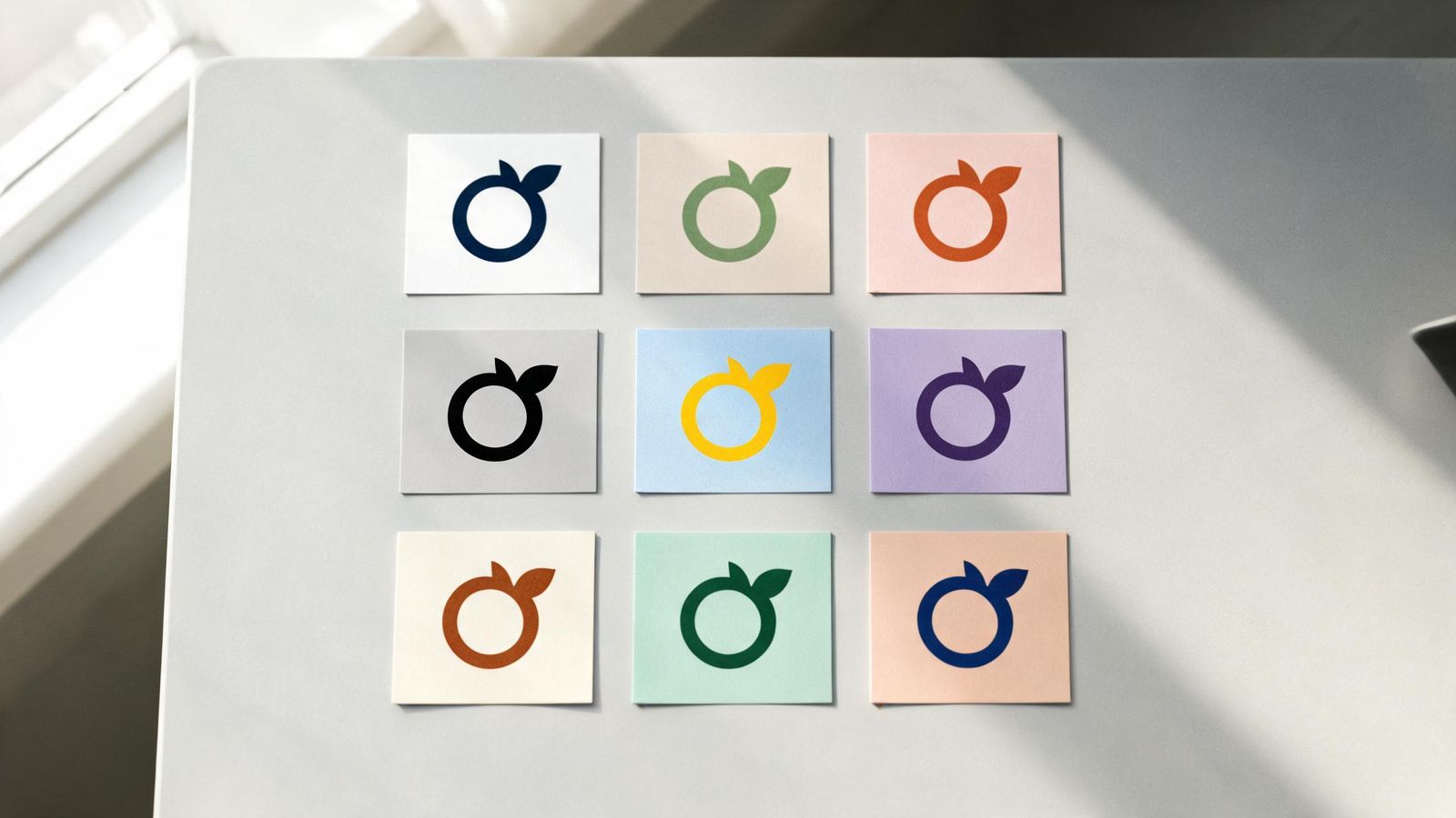
Logo: the wheat ear was simplified, with fewer thin lines, so it works as a sticker and a profile picture. She now has horizontal, stacked and symbol-only versions, in colour and in one colour.
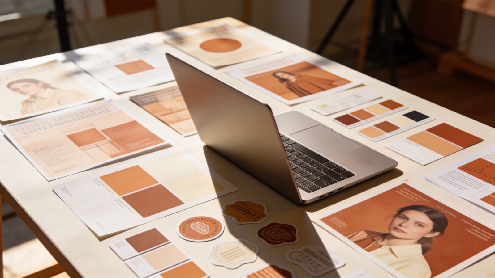
Colours: terracotta, cream and a dark brown for text, with codes written down.
Fonts: one friendly serif for headings, one clear sans-serif for everything else.
What she made
- A brand sheet with all of the above.
- A menu grouped into breads, pastries, cakes and drinks, with prices aligned and allergy symbols.
- Three social templates: product photo, announcement, customer quote.
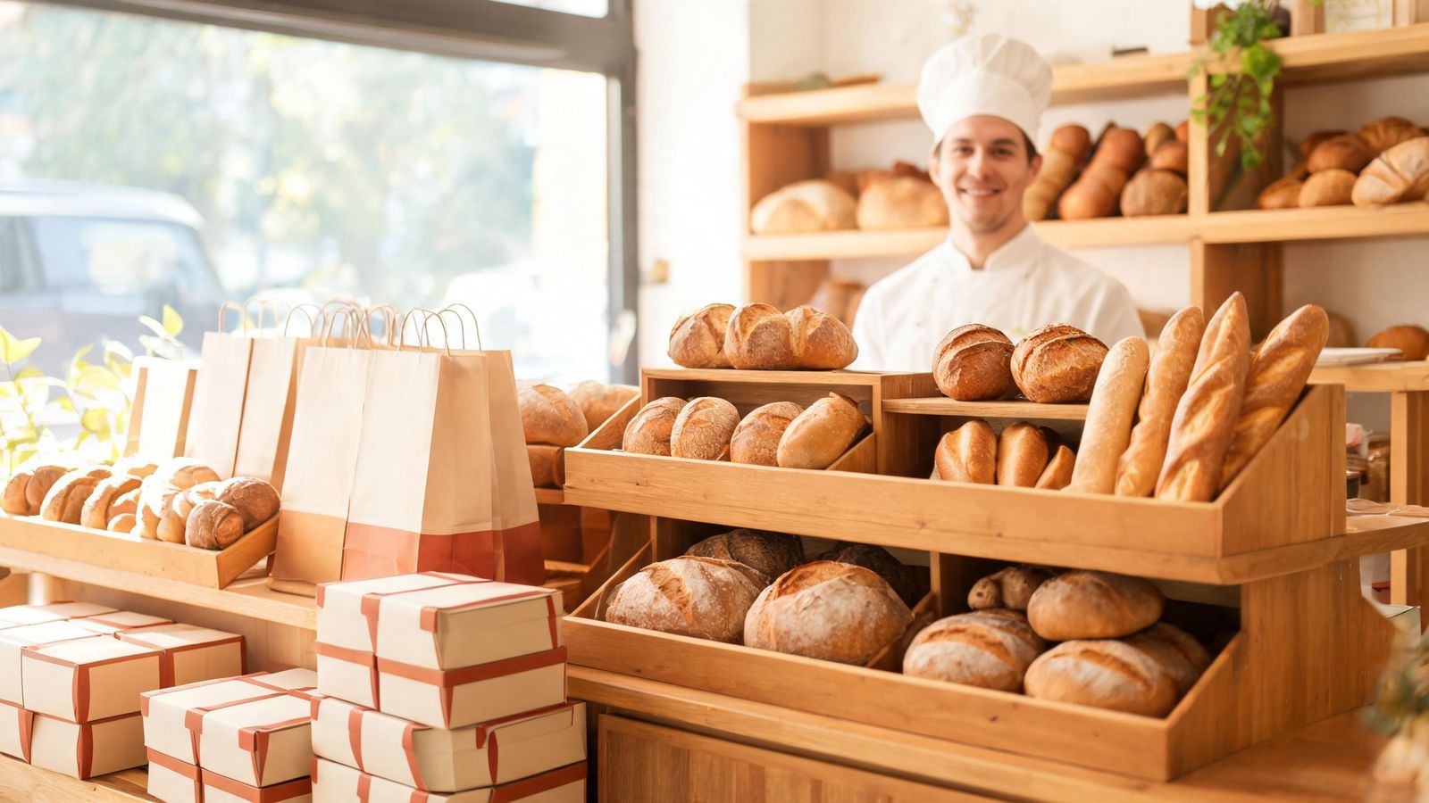
- Stickers for paper bags and cake boxes.
- A festival template with a seasonal accent colour.
What changed
Customers said the shop "looks new" even though it's recognisably the same. The posts look like they belong together. And Rosa spends less time on each new poster, because the templates do the work.