Logos · 2 min
One logo file isn't enough. Different places need different shapes and colours. Here's the set most businesses need. The Goldmend Design logo itself comes in most of these.
Shapes
- Horizontal: symbol beside the name. For website headers, shop signs, email signatures.
- Stacked: symbol above the name. For square spaces, posters, packaging.
- Symbol only: for app icons, profile pictures, favicons, stamps.
- Name only (optional): when the symbol doesn't fit.
Colours
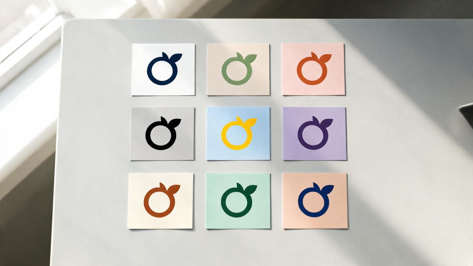
- Main colours on a light background
- Reversed on a dark background (often a light version of the symbol and white text)
- One colour black, for receipts, faxes and stamps
- One colour white, for photos and dark materials
Small version
At very small sizes, fine details disappear. Some brands have a simplified version for tiny uses, with thicker lines and no fine details.
Endorsement line
If you're part of a group or family of products, a small "by ..." line can link them, like "by Goldmend Design" under each of our products.
Files for each
- SVG: for websites and anything that needs to scale
- PNG with transparent background: for documents and slides
- PDF: for printers
Rules of use
On one page, show:
- the space to leave around the logo
- the smallest size it can be used
- what not to do: stretching, recolouring, adding effects