Logos · 2 min
A logo is a signature, not a story. Its job is to be recognised quickly and remembered, on a sign, a cup, a phone screen or a tiny app icon.
Simple wins
The most recognisable logos are usually one shape and a name. Every extra detail makes it harder to remember and harder to reproduce small.
It needs to work at every size
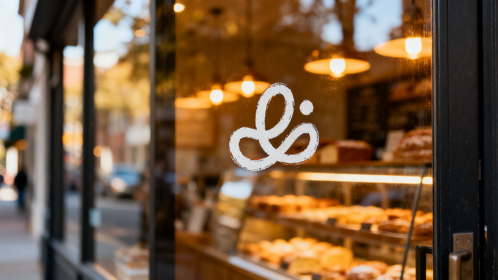
Your logo will appear as a sign several metres wide and as a profile picture smaller than a fingernail. Test both before you decide.
One or two colours
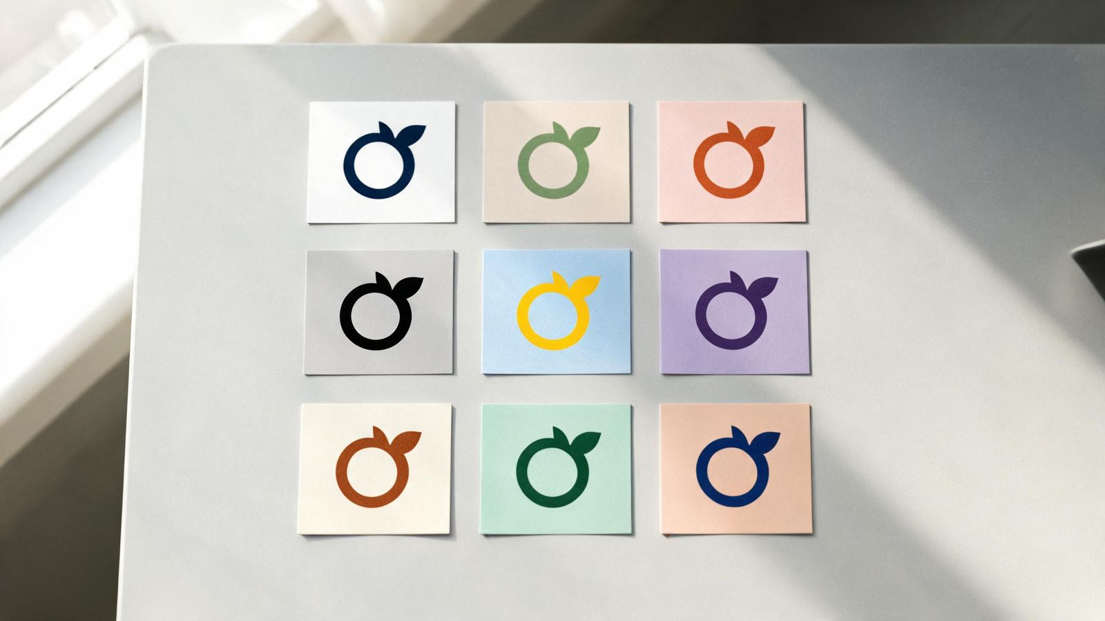
A logo that only works in full colour is a problem on receipts, stamps and embroidery. Make sure it also works in one colour: black, white or your main colour.
Readable name
If your logo includes the name, people must be able to read it. Decorative scripts that look lovely at large size can become unreadable on a business card.
Avoid
- trends that will date quickly
- clip art and stock icons that others also use
- anything close to a famous brand's logo
- tiny text, like a slogan, inside the logo
Your logo set
You need a few versions:
- full logo: symbol and name
- symbol only: for icons and profile pictures
- one-colour versions: for dark and light backgrounds
Keep the files
Ask for or export your logo as SVG (sharp at any size), PNG with a transparent background, and a PDF for printers. Keep them in one shared folder.