Print · 2 min
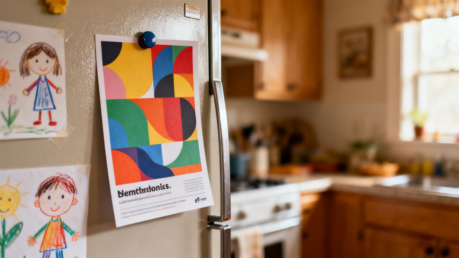
Most flyers are glanced at and thrown away. The ones that survive are useful. Design for the fridge, not just the letterbox.
Make it useful
- a price list people will need again
- a timetable or opening hours
- an offer valid for a few months
- a delivery menu with your number
One clear purpose
Front: the main message and a strong picture. Back: the useful details. Don't try to tell your whole story.
Your number big and clear
If the action is "call us" or "order by message", make the number one of the biggest things on the page, with country code if you serve visitors.
Clear offer, honest terms
"10% off your first order, until 31 March" works. Small print that cancels the offer doesn't.
Easy to read
- dark text on light paper
- simple font, at least 9 to 10 point for body text
- short sections with headings
Size
A5 (half of A4) is a common, handy size. Postcard size works for simple offers. Large flyers get folded and lost.
Paper
Slightly thicker paper feels worth keeping. Recycled paper is a nice touch, and you can say so.
Track it
Add a simple code, like "Mention FRIDGE for your discount", so you know whether the flyer brought customers.