Print · 2 min
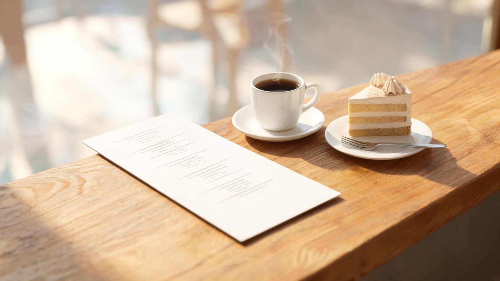
A good menu helps customers choose quickly and confidently. That makes the queue faster and customers happier.
Group it the way people think
Drinks, breakfast, mains, sweets. Within each group, keep the list short. Long lists slow decisions.
Make names and prices easy to scan
- Item name in bold, then a short description.
- Prices lined up in one place, without the currency symbol on every line if it's clear at the top.
- Avoid dotted lines leading to prices; they make people hunt for the cheapest item.
Describe briefly
"Grilled chicken, rice, sambal, egg" tells people more than "Signature Chicken Delight". Use the words customers use.
Highlight a few
Mark two or three favourites or house specials with a small symbol or a box. Too many highlights cancel each other out.
Photos: few and real
A few real photos of bestsellers help, especially for visitors who don't read your language. Too many photos make a menu cluttered.
Allergies and diets
Use clear, consistent symbols for vegetarian, vegan, contains nuts and so on, with a key. Make sure they're accurate, checked by whoever cooks.
Languages
If many customers are visitors, add a second language in a smaller size under each item, or a separate menu.
Readable in real light
Restaurants can be dim. Use dark text on a light background, a clear font, and at least 10 to 11 point text for print.