Print · 2 min
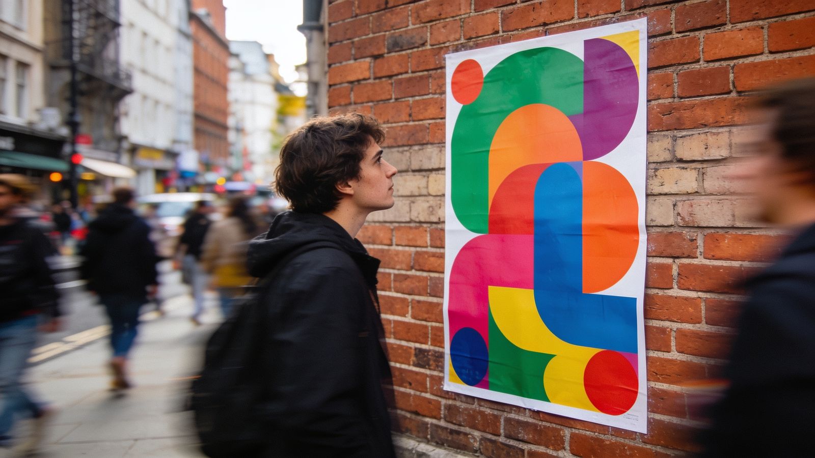
People pass posters at walking pace. You have about three seconds. A poster that tries to say everything says nothing.
One message
Decide the single thing someone must understand. "Night market, every Friday." Everything else is supporting detail.
Three levels of text
- Headline: the one message, very large.
- Key details: when and where, medium.
- Small print: website, extra info, small.
If you need more than three levels, you have too much text.
Big enough to read
As a rough guide, headline letters should be at least 1 cm tall for every metre away people will read from. Test by printing it and stepping back.
Strong contrast
Dark on light or light on dark. Avoid text over busy photos. If you must, add a solid band behind the words.
One strong picture
One big, clear image beats a collage. It should show what you're promoting: the food, the event, the product.
Leave space
Empty space around the headline makes it stand out. Crowded posters are skipped.
Practical details
- Include the date and the day: "Sat 14 Dec".
- Add a short web address or a QR code, with a few words saying where it goes.
- Use your brand colours and logo so people link it to you.