Print · 2 min
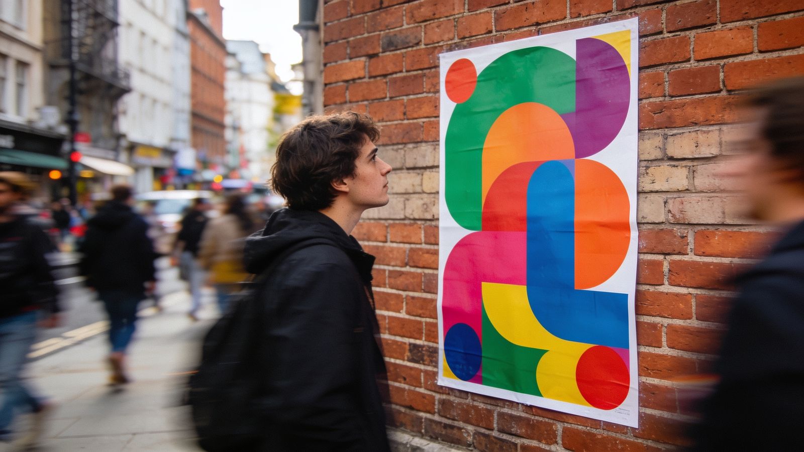
You design a poster in a lovely bright blue, and it comes back from the printer looking dull. You're not imagining it. Screens and printers make colour in different ways.
Light versus ink
- Screens make colour with light: red, green and blue (RGB). They can show very bright, glowing colours.
- Printers make colour with ink: cyan, magenta, yellow and black (CMYK). Ink on paper can't glow, so some bright colours can't be printed exactly.
Bright blues, greens, oranges and pinks change most.
What to do
- Ask your printer what file and colour settings they want. Many accept RGB PDFs and convert them; some want CMYK.
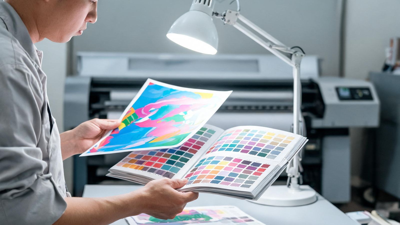
- Get a printed proof for anything important, and look at it in daylight.
- Keep a printed swatch of your brand colours from your printer, and compare future jobs with it.
Brand colours for print
Write down both versions on your brand sheet:
- the screen colour (like #1F6F68)
- the print colour (CMYK values, or a spot colour code from a colour matching system, if you use one)
Paper changes colour too
Uncoated paper absorbs more ink, so colours look softer. Glossy paper looks brighter. Off-white paper warms everything.
Black isn't just black
For large black areas, printers often use a "rich black" mix of inks so it looks deep, not grey. Ask your printer, and keep small text in plain black so it stays sharp.