Print · 2 min
Your shop sign is seen by more people than anything else you make. It's also expensive to change, so it's worth planning carefully.
Name first
The business name should be the clearest thing. People need to read it from across the road, in a moving car or bus.
One line about what you do
If your name doesn't explain it, add a few words: "Bakery & Coffee", "Phone Repairs". Keep it short.
Contrast for day and night
- Strong contrast between letters and background.
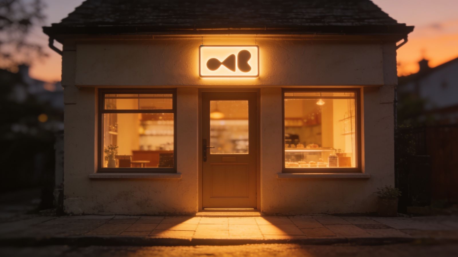
- Think about how it looks lit at night: backlit, front-lit or neon.
- Avoid thin letters that disappear at a distance.
Size
Bigger than you think. Mock it up: print the letters at full size on paper and tape them up, then cross the street and look.
Match your brand
Use your logo, colours and font, so the sign links to your website, cards and bags. But simplify: fine details are lost on signs.
Local rules
Many places have rules about sign size, lighting and placement, especially in historic streets. Check with your local council or landlord before ordering.
Other signs matter too
- opening hours on the door, kept up to date
- the street number, so delivery drivers find you
- a small "We accept" sign for payment methods
Photos of your sign
Your shopfront photo appears on maps and review sites. A clean, readable sign helps people recognise you when they arrive.